Rafo B
Money Beyond Borders.
Send, spend, and receive money across countries — without the fees, confusion, or delays. We designed a full financial platform for foreign workers that makes every transaction feel predictable, safe, and human.
Money Beyond Borders.
Send, spend, and receive money across countries — without the fees, confusion, or delays. We designed a full financial platform for foreign workers that makes every transaction feel predictable, safe, and human.
Overview
Rafo B is a fintech platform designed specifically for foreign workers — people who send money home every month, often under real financial pressure. The platform gives users a global account with a local IBAN, a physical or virtual card, crypto wallet, and even SIM & eSIM management — all under one roof, all designed to feel like it was built for them.
We designed the entire product experience: from a marketing site that earns trust before the first sign-up, to every screen of the app's core flows, to an employer dashboard that lets companies pay foreign workers directly. The brief was broad. The standard was high. Every decision had to make complex financial actions feel simple and safe.
The Problem
"If something goes wrong with this transfer, it's my family who feels it."
That's the weight behind every transaction on Rafo B. Foreign workers sending money internationally face a combination of high fees, opaque conversion rates, and interfaces built for people already familiar with financial systems. Anxiety isn't a side effect — it's the default.
01
High fees with no transparency
Users feel like they're losing money without understanding why. Hidden charges erode trust before a relationship even begins.
02
Fear of making mistakes
"I'm always afraid to press the wrong thing." In high-stakes financial actions, hesitation and error cost real money — and confidence.
03
Systems that weren't designed for them
Most fintech products assume financial literacy and language fluency. They weren't built for users who send money home every month and just need it to work.
Research & Insights
Through stakeholder interviews, behavioral analysis, and competitive research, three truths became clear: simple visual language is non-negotiable, errors must be prevented rather than recovered from, and users need constant reassurance throughout any financial action.
"I'm always afraid to press the wrong thing."
"I feel like I'm throwing money away on remittance fees."
"I send money home every month. I don't want to think too much — just do it and be sure it worked."
"I need it to be simple. This isn't something I want to experiment with."
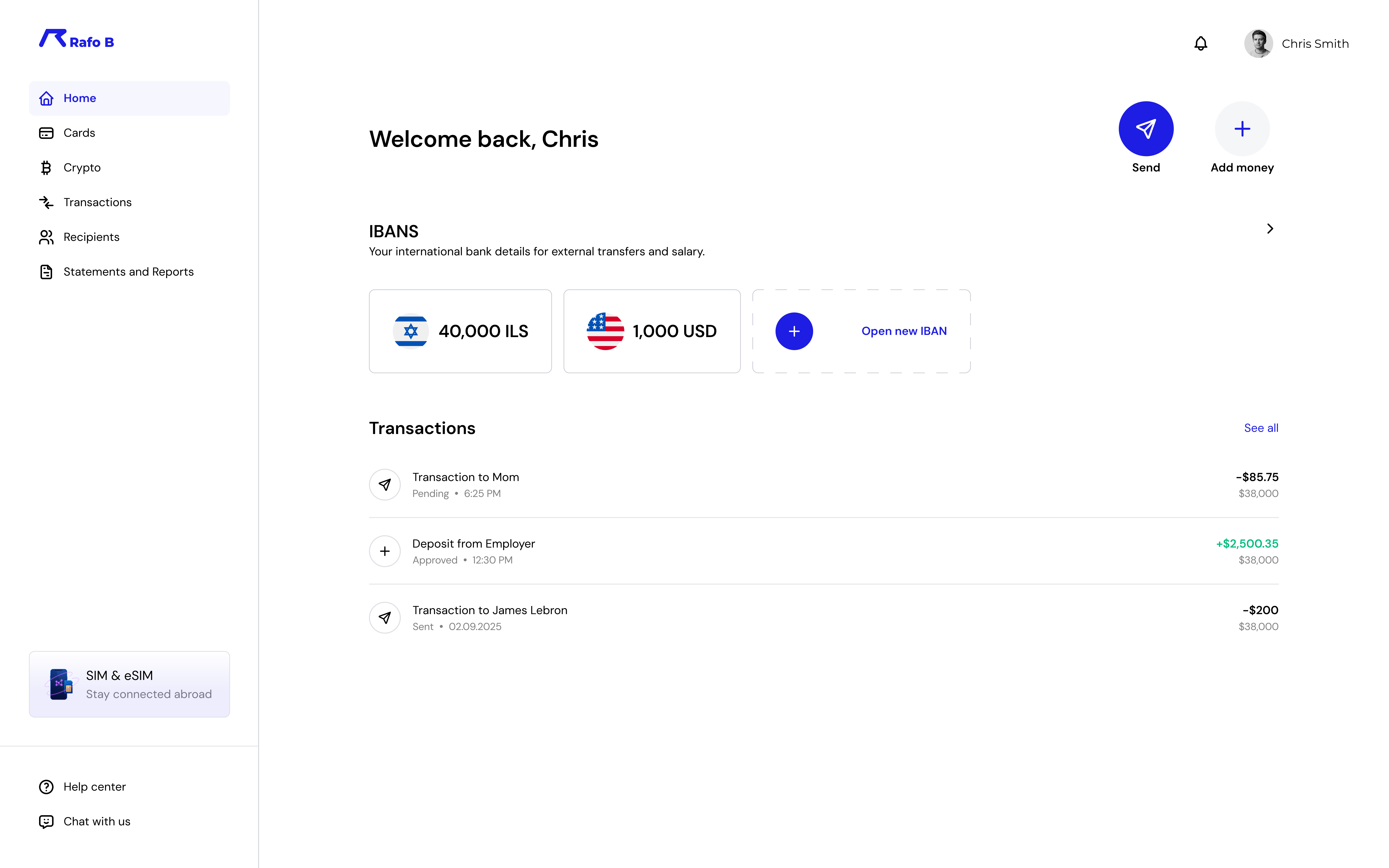
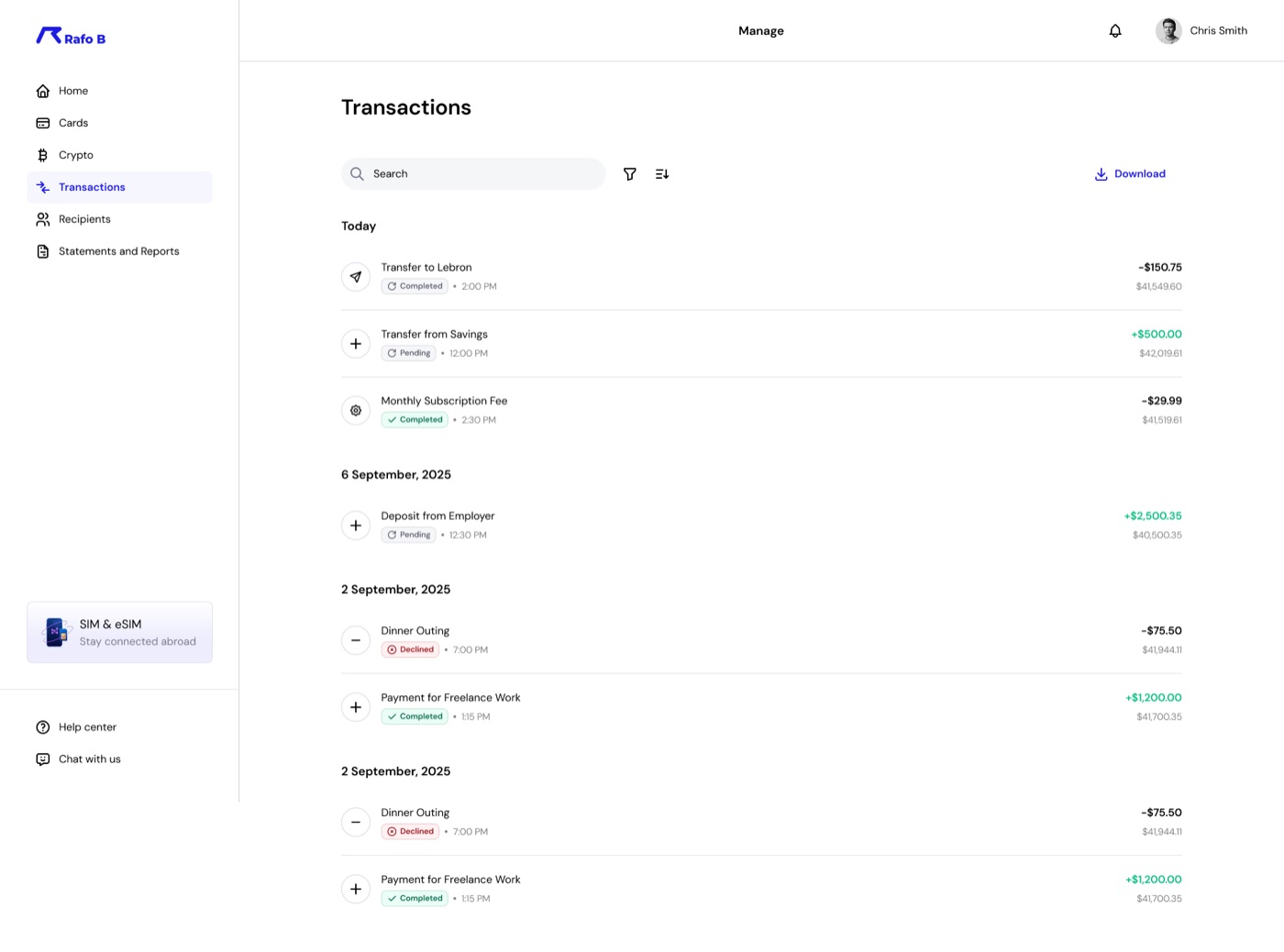
Core Experience
That's the promise — and the design challenge. The send flow is the heart of the product, so every screen had to earn its place. No unnecessary steps, no jargon, no moments of doubt. Users see exactly what will happen before they commit, and know exactly when it's done.
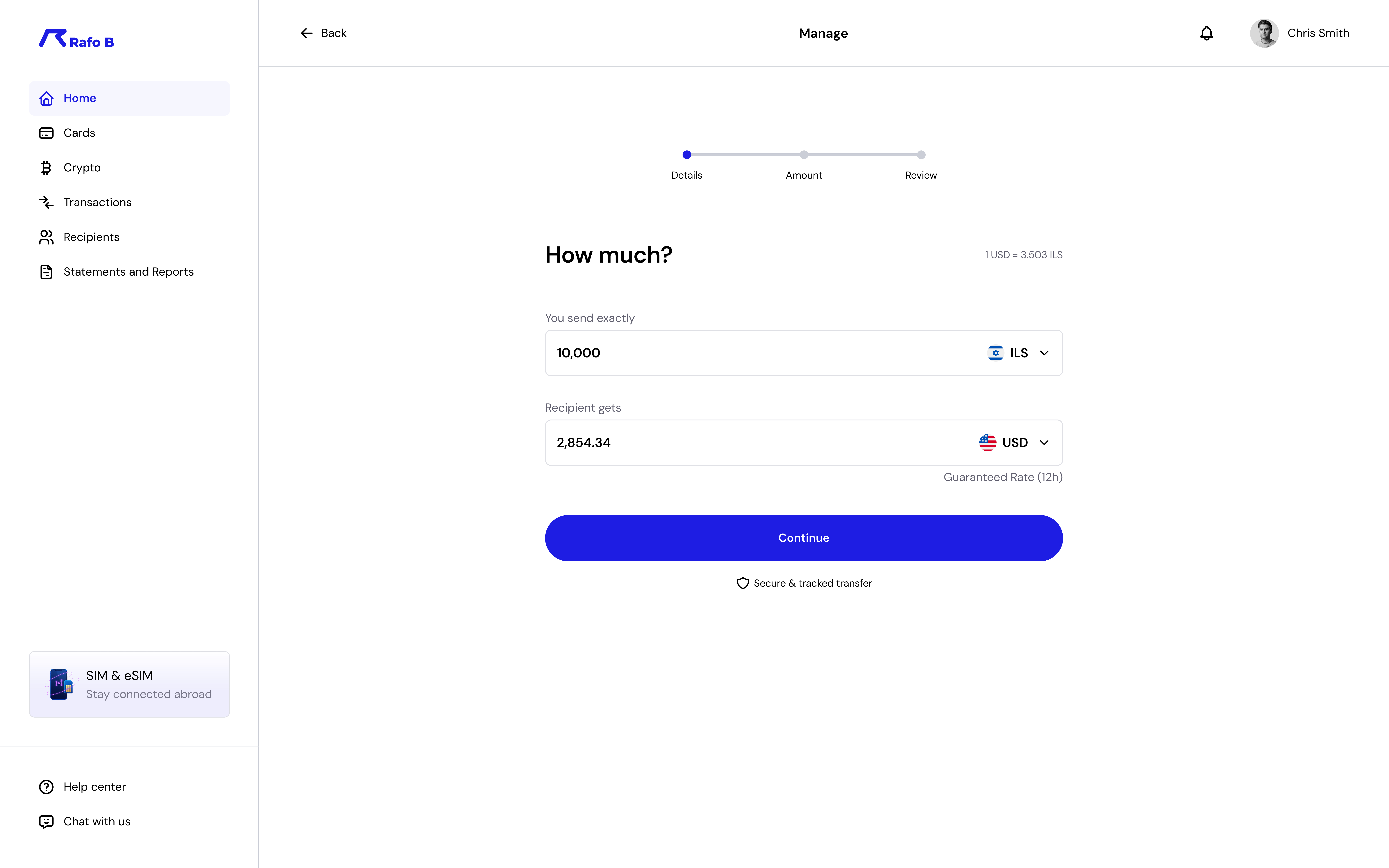 Step 1 — Amount & recipient
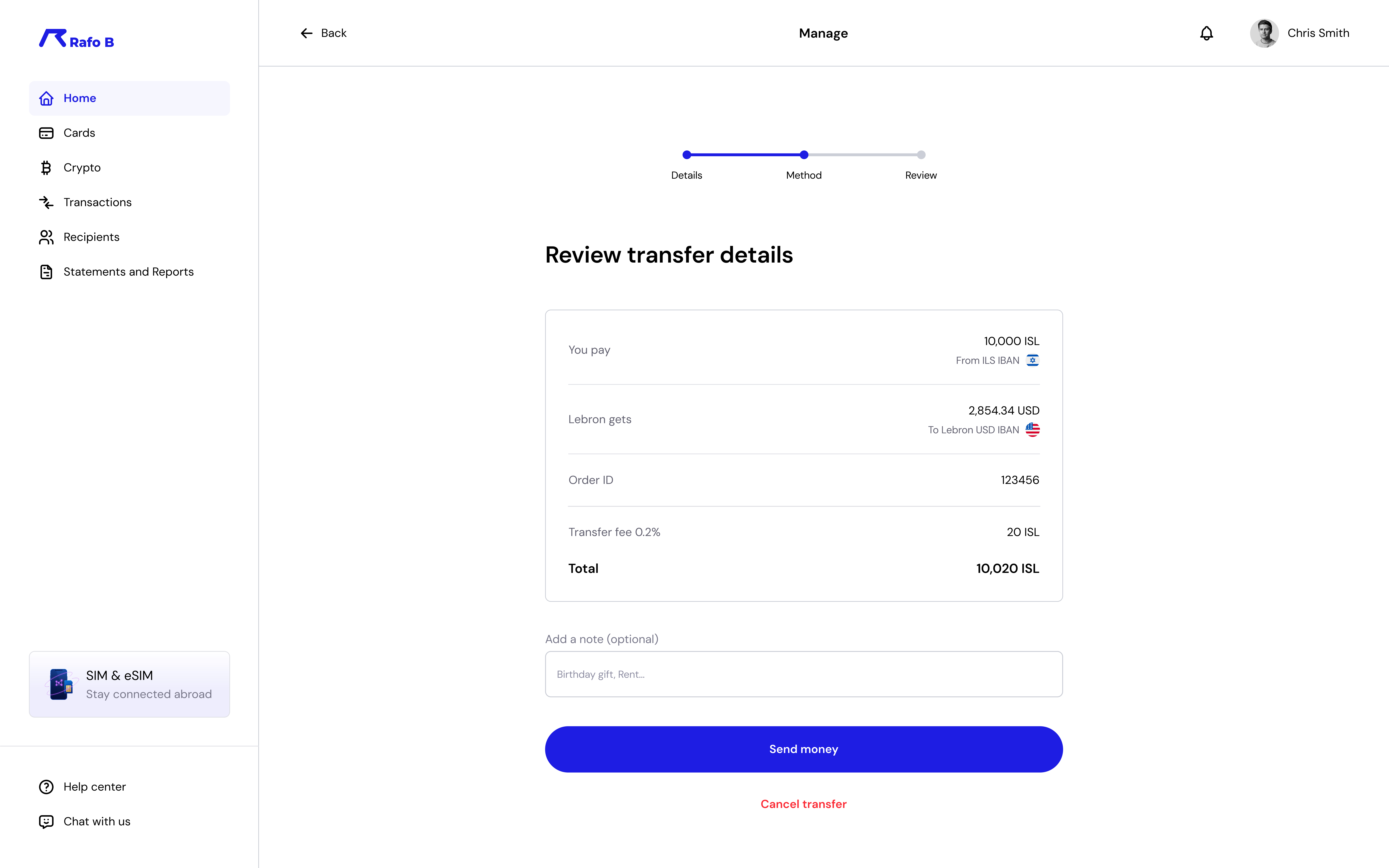 Step 2 — Full review before committing
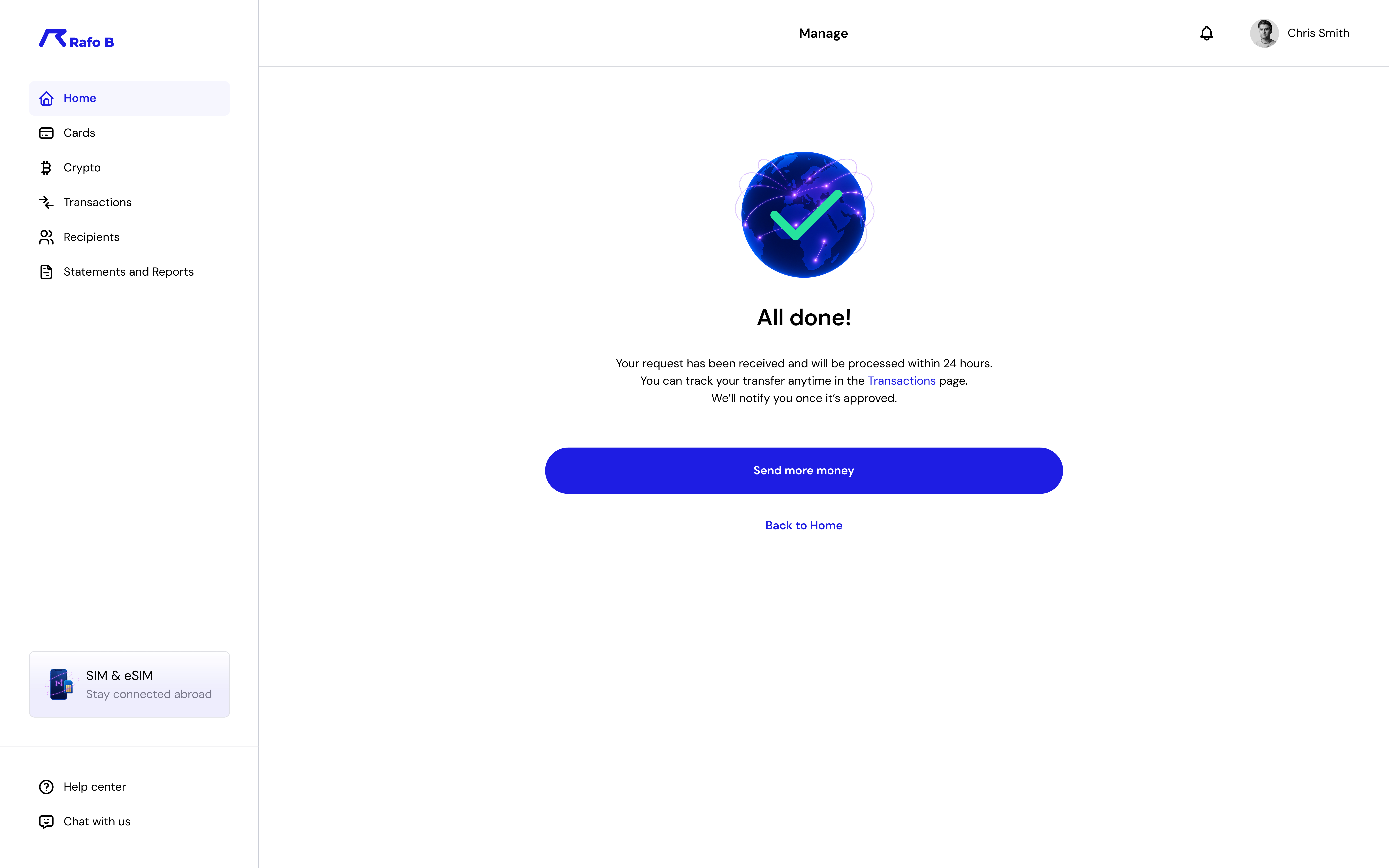 Step 3 — Warm confirmation
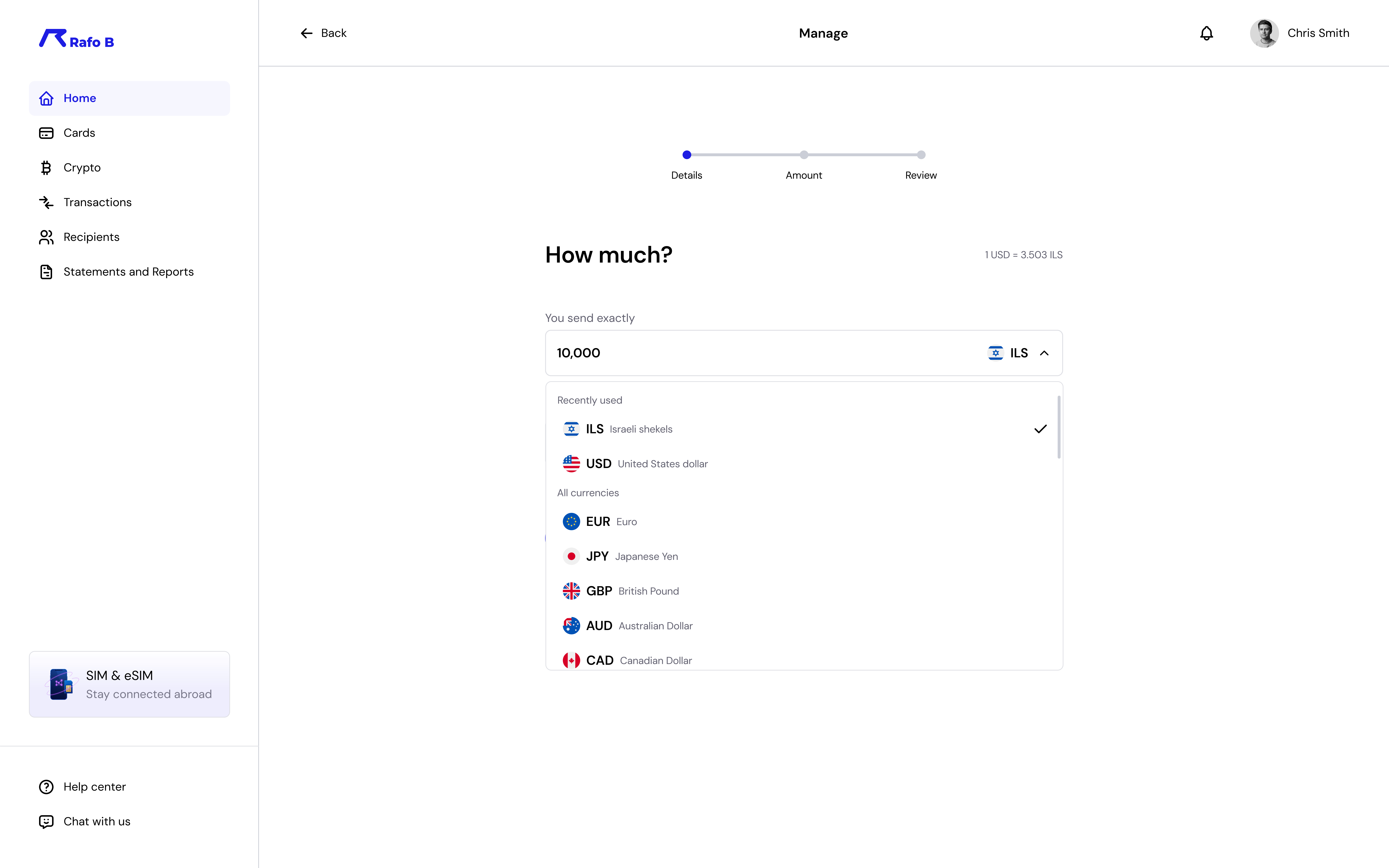 Currency selection — searchable, flag icons, recents first
Transparent rates
You send / recipient gets shown side-by-side with a guaranteed rate — no surprises at the end.
Review before sending
A full summary screen before any money moves, with the total fee clearly broken out.
Positive reinforcement
The "All done" state is warm and reassuring — tracking info surfaces immediately so users never feel in the dark.
Adding Money
The add money flow follows the same logic — one decision at a time, no clutter. Users choose a currency, pick a method (card, bank, IBAN), and see an instant confirmation once funds arrive. The toast on the home screen closes the loop immediately.
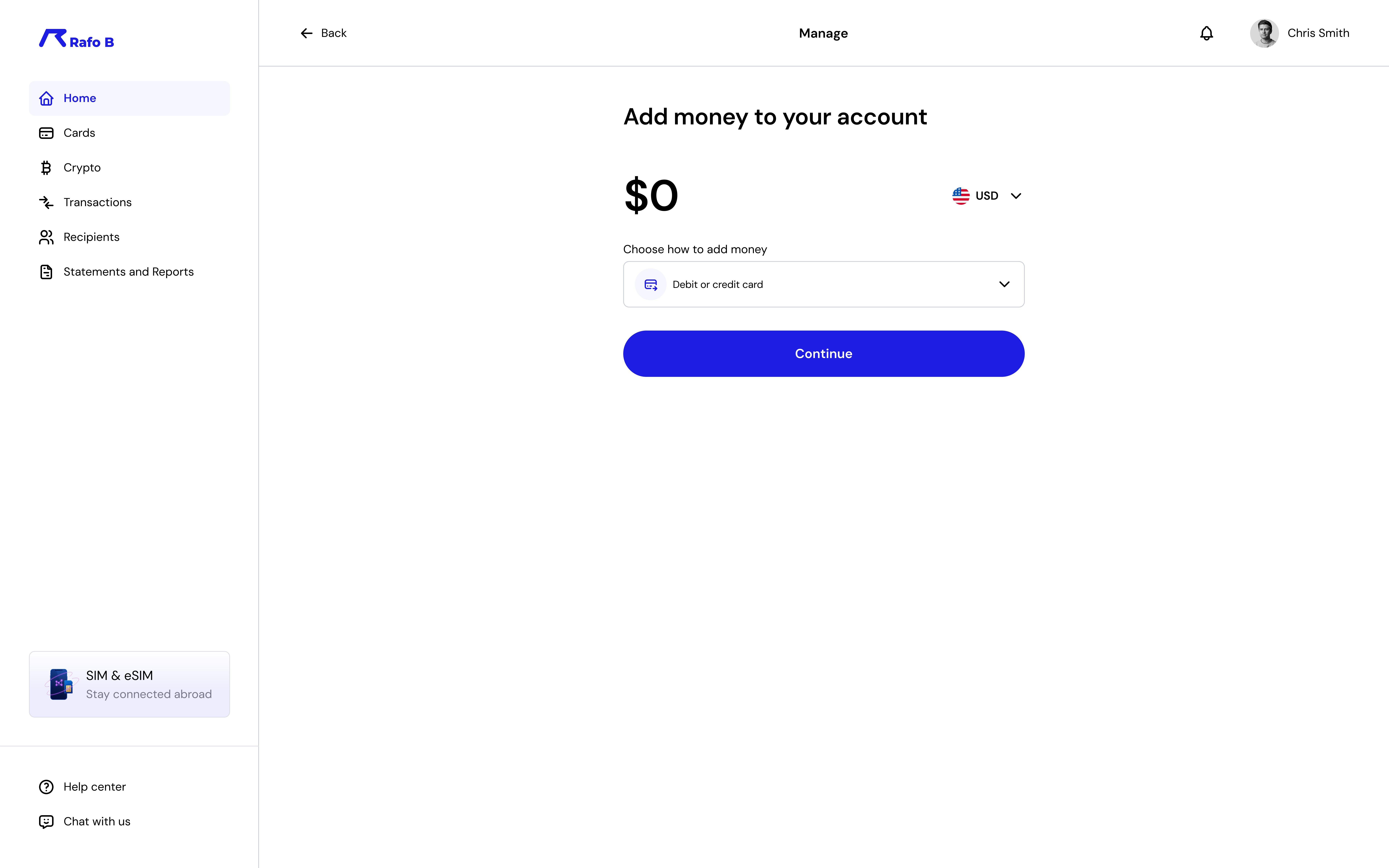 Choose amount & payment method
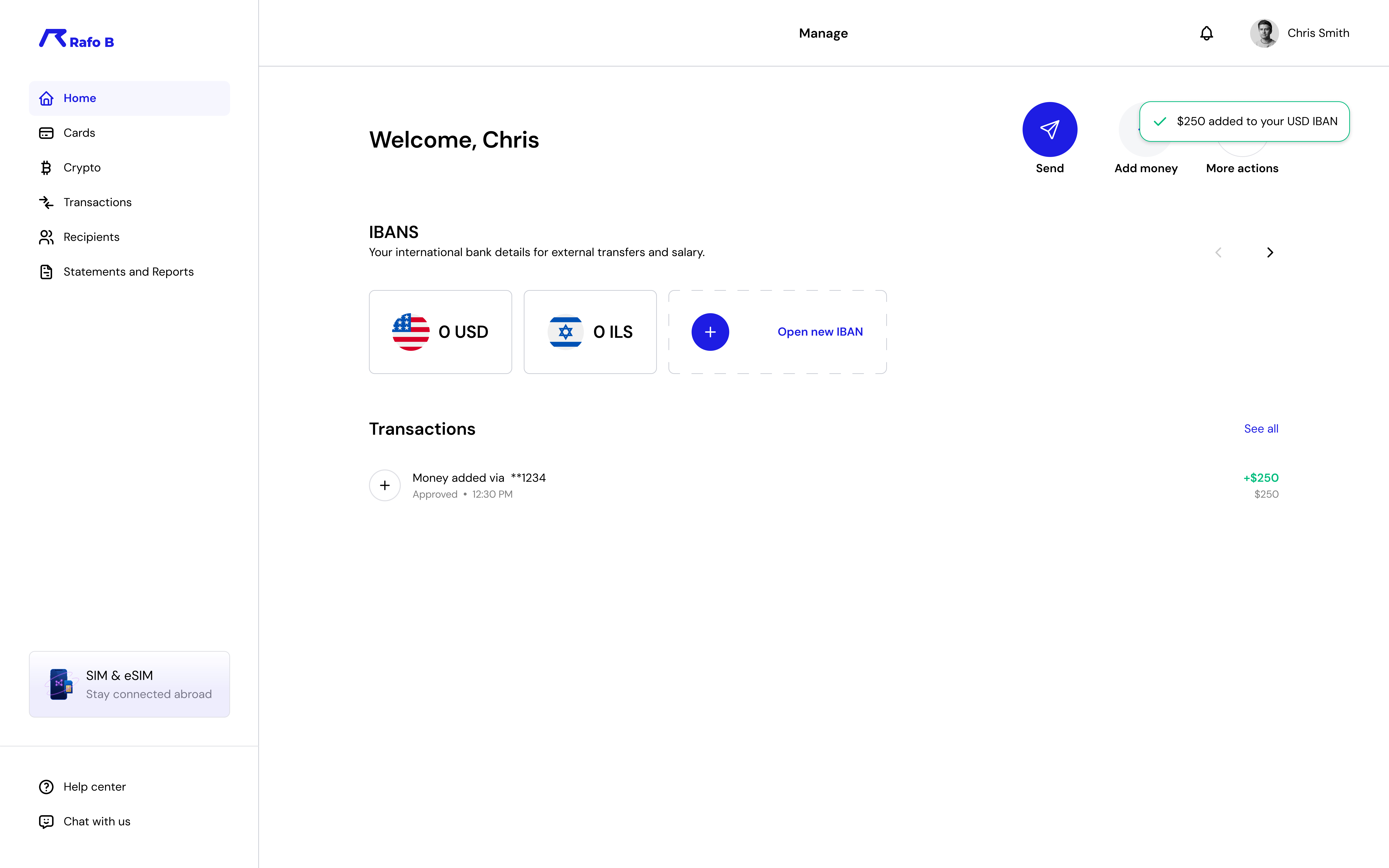 Funds confirmed — toast closes the loop instantly
Repeat Use
Rafo B isn't a one-time transaction tool. Most users send to the same few recipients on a fixed schedule. The recipient profile surfaces behavioral insights — total transferred, frequency, history — so regular senders get a meaningful picture of their financial relationships, not just a list of names.
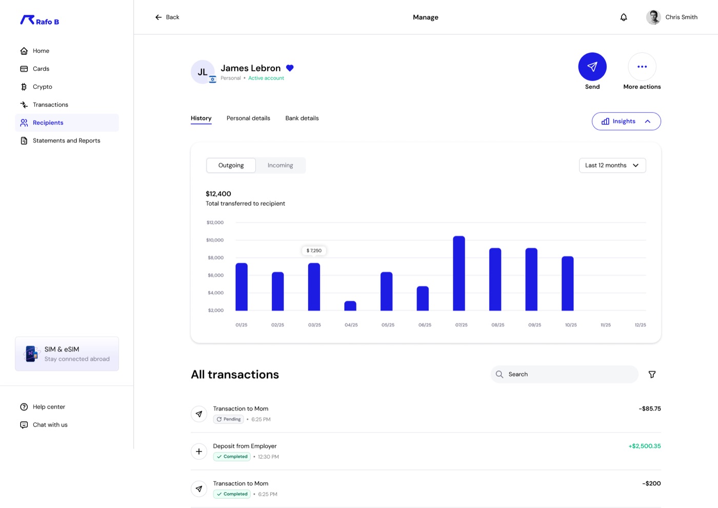 Recipient insights — transfer history, frequency, totals at a glance
 Recipients overview — fast repeat access
Extended Ecosystem
When users switch to the crypto section, the interface shifts into dark mode. This wasn't just a visual preference — it's a deliberate signal. Crypto carries different risk and different context. The environment communicates that shift without a single word of explanation.
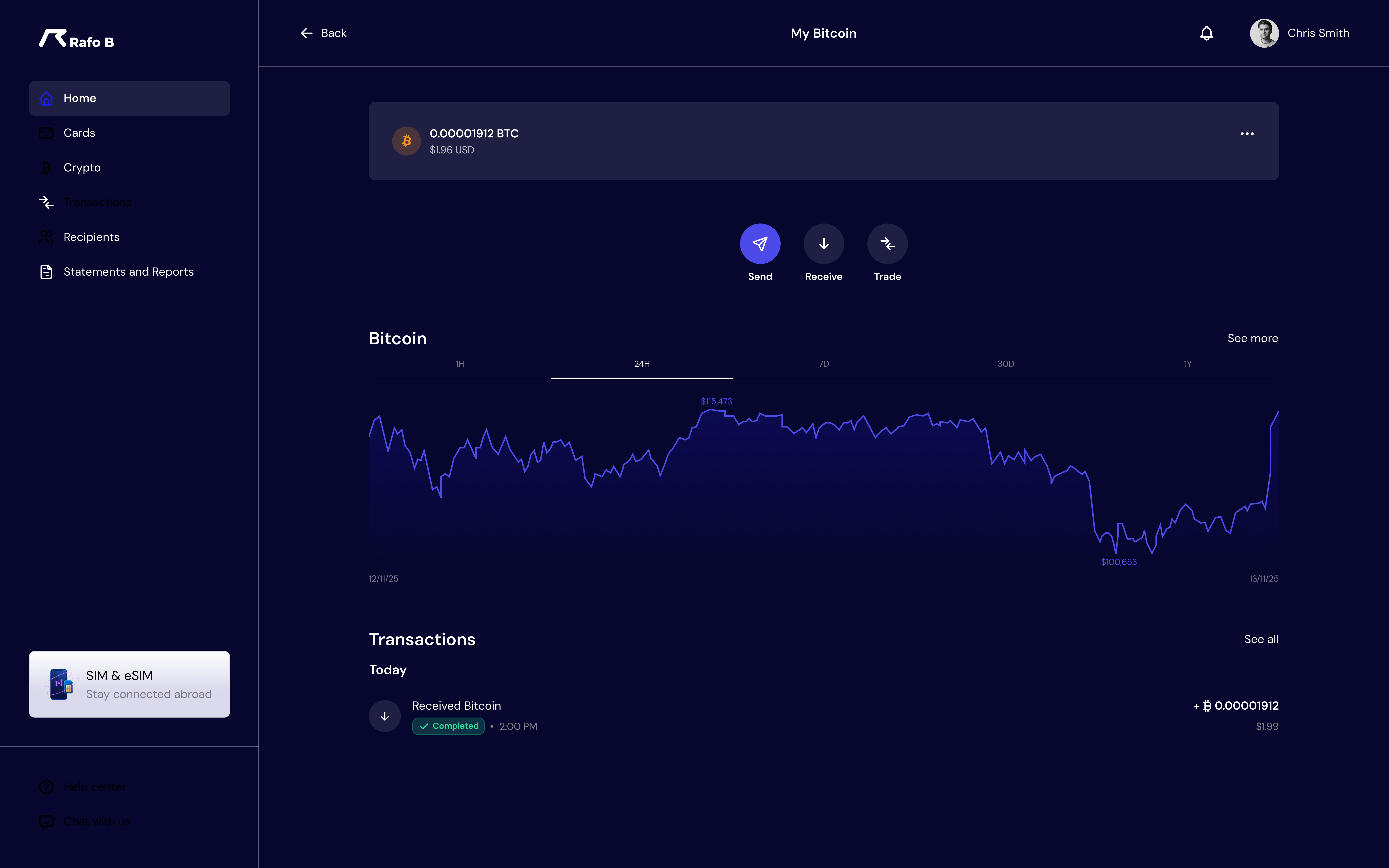 Bitcoin wallet — real-time chart, send / receive / trade actions
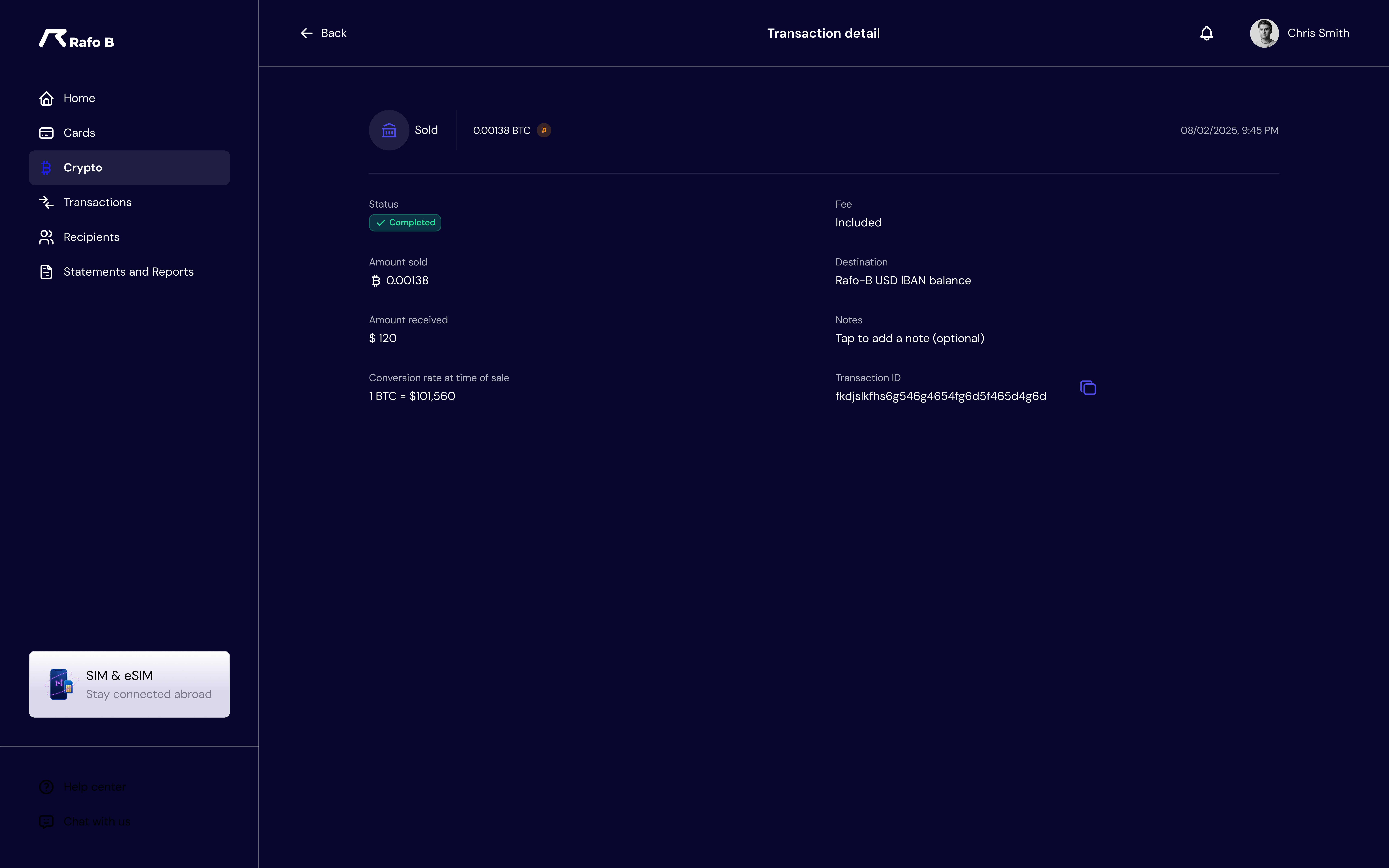 Crypto transfer — simple amount entry
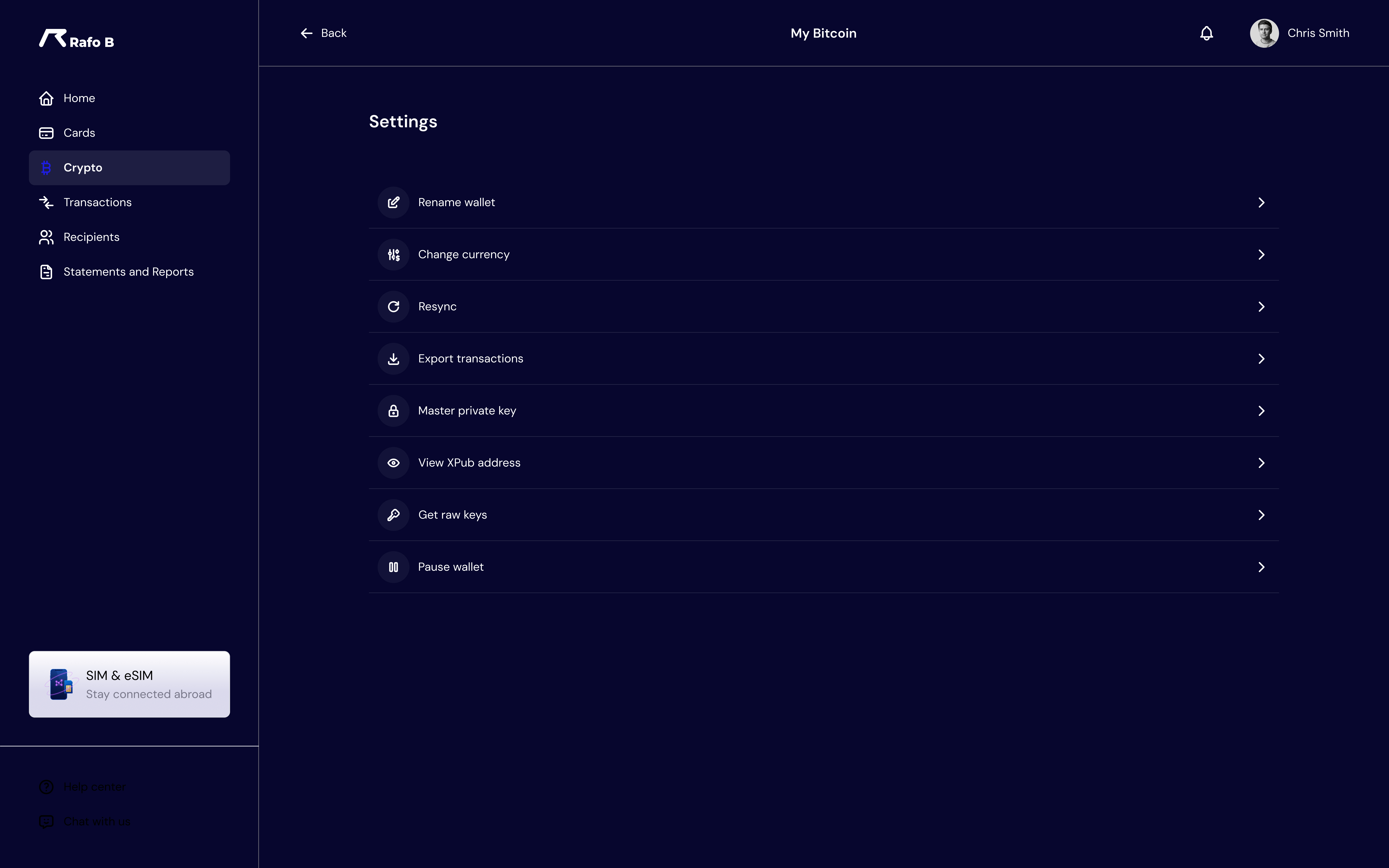 Asset settings — toggle visibility, reduce clutter
Card Management
Rafo B issues physical and digital prepaid cards in multiple currencies. Balance at a glance, recent transactions inline, and a clean distinction between card types. No jargon, no buried settings — just the controls users actually need.
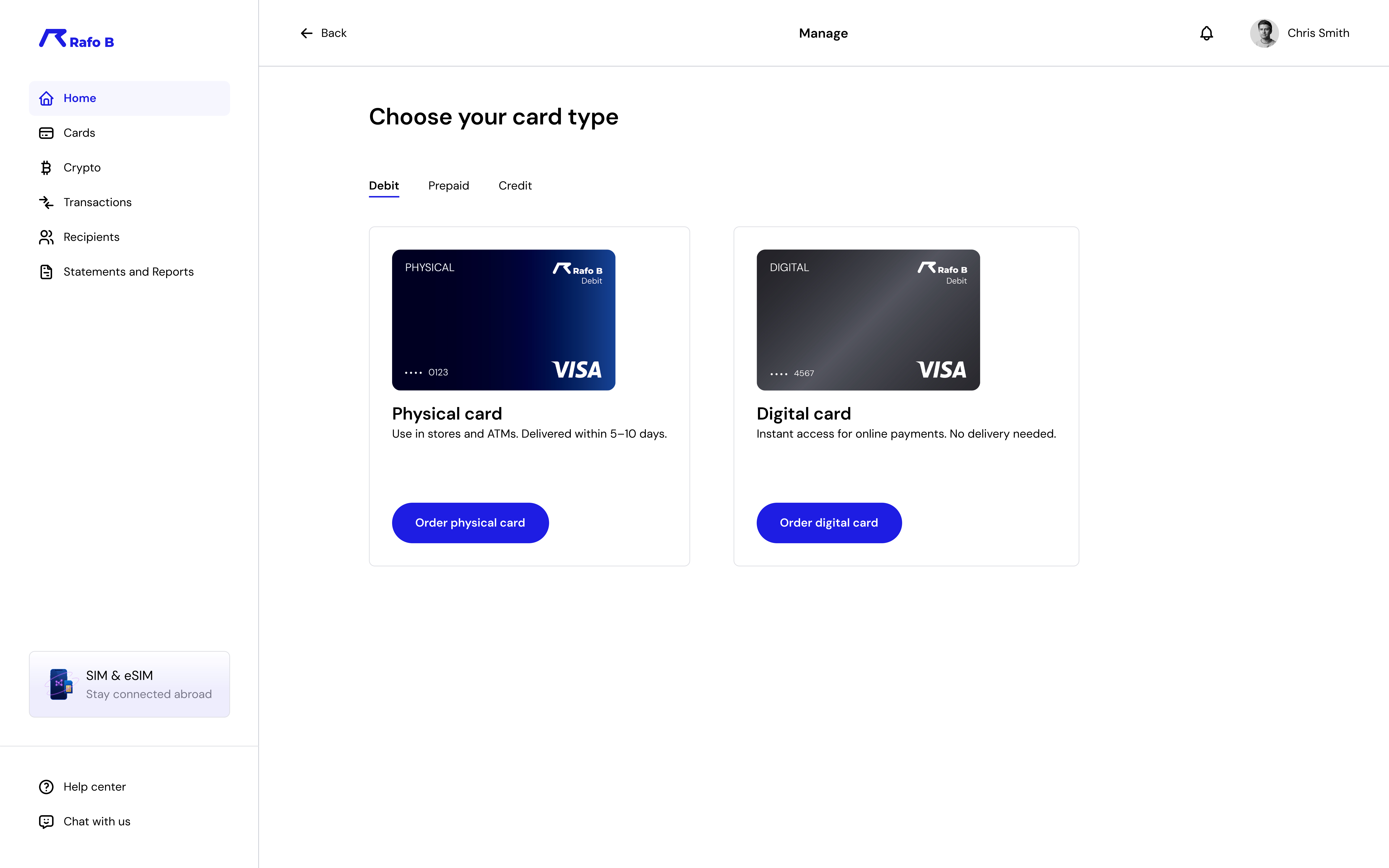 Physical vs digital — clear choice, simple onboarding
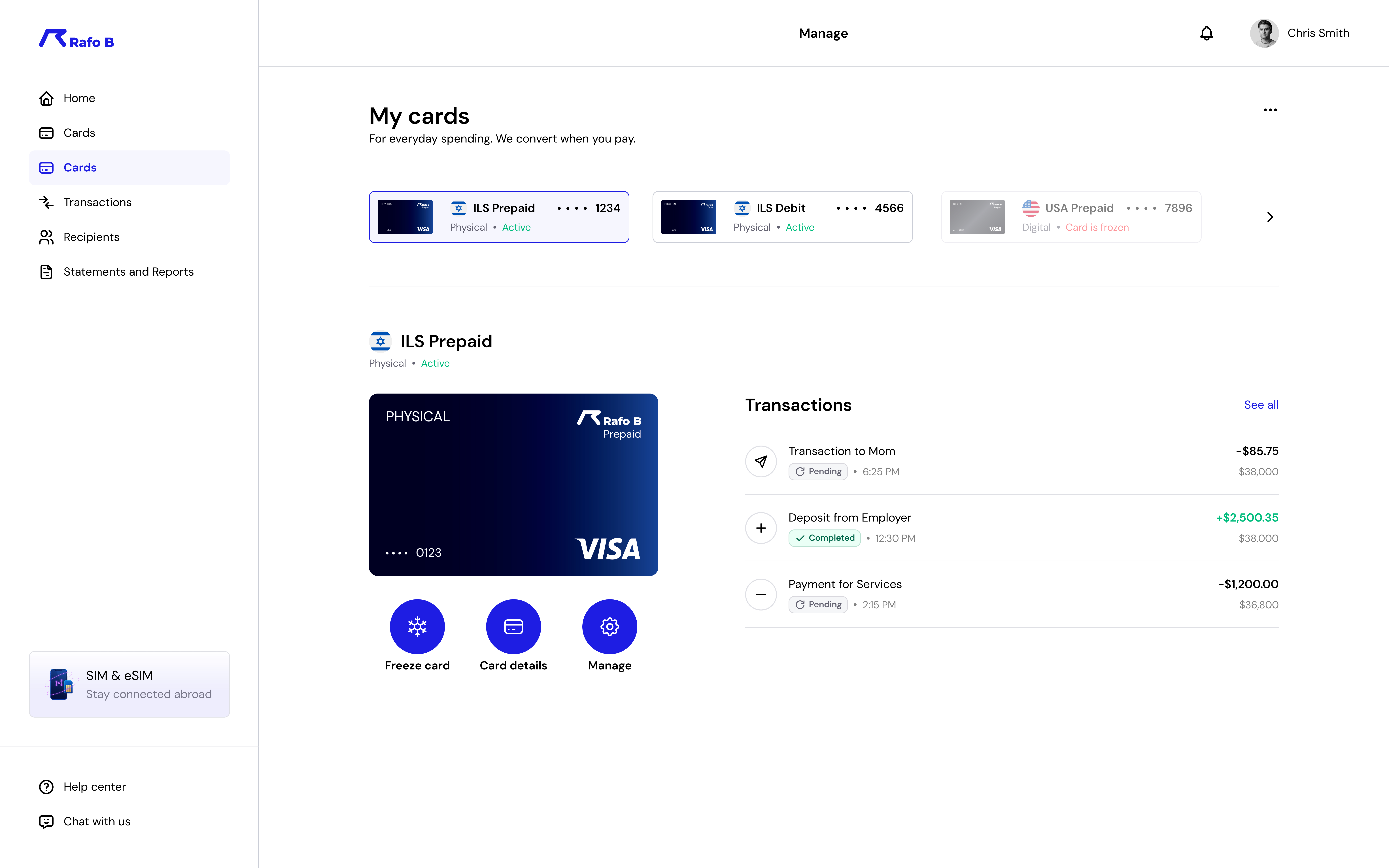 Card management — balance, transactions, freeze & manage
What guided every decision
01
Not stated — felt. Through clarity, feedback, and the complete absence of surprise. Security features like biometric login, instant card freezing, and fraud detection were surfaced visibly, not buried in settings.
02
150,000+ customers send money on a fixed schedule. They can't navigate the same friction every time. Every recurring flow was stripped down to its minimum viable steps — without losing clarity.
03
Confirmations aren't just functional — they're emotional. A warm "All done" screen, an instant toast notification, a clear receipt. These moments are what bring users back next month.